

Landing page design: user experience, decision-making processes


“Landing page of an online advertising campaign, that is, the page where the user arrives after clicking on a link inserted in a search result or in an online advertisement” or “in web marketing, is a specific web page structured for the visitor to reach after clicking a link or an advertisement”. These are just a couple of the many definitions of the Landing page.
They are certainly correct definitions: this is the page where the user lands, intrigued by a previous interaction, the one responsible for convincing him to click on your call-to-action or to leave you his contact information. Where people make a decision; and this decision will determine whether the business goals that gave rise to the campaign are met or not.
From a technical point of view, the landing is a page positioned at the end of a series of clicks; from the user experience point of view, it represents the moment in which a user will have to make a decision: an event
- inserted within a broader flow of interactions, which conditions it in various ways;
- which produces measurable results, with useful data to guide continuous improvement;
- that must be prepared by taking into account the specific users and objectives, the context, the type of decision that you want to support: only in this way, the design will be effective.
In this view, the landing page corresponds to the Behavior Model suggested by BJ Fogg. If it is proposed in a condition in which the user is sufficiently motivated and the requested action is easy enough, it will probably be able to trigger a behavior, otherwise, it will fail.
The same landing page, therefore, presented in different situations, may lead to opposite results.
The landing page as a tool: a set of ready-made components
It is enough to do a short online search to find numerous articles that aim to explain how to build a landing page correctly: even long and detailed documents such as those found on the business blogs of Unbounce, Hubspot and Instapage or focused on the most distinctly graphic aspects such as those published from Invision.
These articles share the same approach, trying to answer the question “How can I increase the conversion rate of my landing page?”
The answer is to use one of the many tools available online: there is something for everyone, they offer solutions that are very different in terms of costs and features, but they all conceive the Landing page as a set of modules to assemble and disassemble, like Lego bricks.
In this model, the design of the landing page is a slalom between errors to be avoided, following simple, standardized instructions. Without stimulating design solutions capable of taking real steps forward.
.png)
The landing page as part of a longer funnel
The landing page design approach does not consider its role within a much longer funnel. Even if it is a single page that is not integrated in the institutional website, the Landing page is not isolated: the user arrives there starting from an Adwords ad or from a newsletter; and leaves it generating an immediate or deferred conversion over time.
For its part, the user is placed in a much broader media ecosystem with which the Landing page must communicate: one user may want to share it on social media, while another may be intrigued by the content and may search Google for other information, and another one may wish to contact support.
The diversity of users (and the specific case) must be taken into consideration before thinking about the design: the more different users will be, the more landing pages will be designed to optimize each experience.
The landing page and the design supporting the decision
For us at Conflux, the design answers the question “How does the user decide whether to click on the CTA or fill out the form? How can I influence this decision? “. The objective that the brand aims at is analyzed by adopting the user’s point of view, studying his characteristics, his needs, and his demands. It’s time for the decision: the landing page will have to provide the answer to your question, the solution to the problem that maybe you didn’t know you had, or that you hadn’t yet focused on.
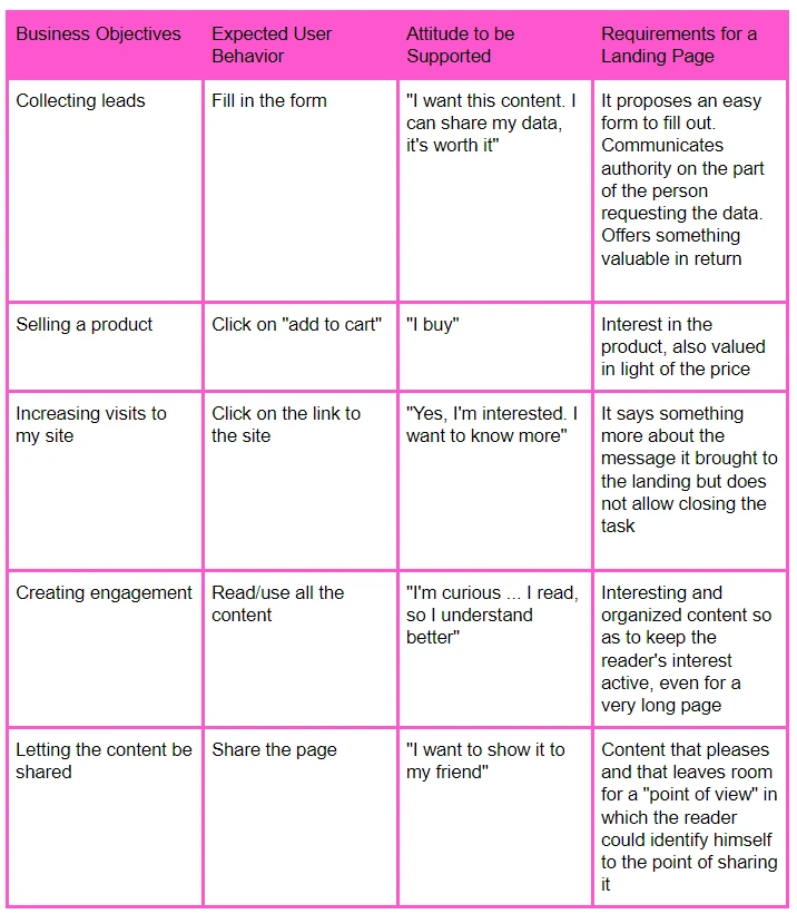
Different decisions of the user correspond to different categories of objectives; each of these decisions is characterized by specific actions on the page (buying, filling the form), but also by the attitude that the user must adopt in order to be motivated to carry out this action.
- If the goal is to collect the lead contacts, the action I request from those arriving on the landing is to fill out a form. To obtain this result, the user must establish that “it is worthwhile”: on the one hand, it will reflect on the time needed to fill in the form and on the opportunity to transfer his data; the perceived value of what is offered (a discount, a premium content, participation in an event, etc.) must justify this “investment”.
- If the goal is to sell a product, the action I require from those arriving on the landing page is to click on the call-to-action “Add to cart”. To achieve this, the user must start to desire the product that you are proposing: it is important to highlight the characteristics of the product, the discount or the promotion in progress, building a sense of “urgency”.
- If the goal is to increase visits to your site, the action I request from those arriving on the landing page is to click on the link to the site. To achieve this, the user must be intrigued by the anticipated content on the landing page, having an eager to learn more: it is important that the landing page adds something to the message that attracts the user, without allowing him to finish the operation.
- If the goal is to create engagement, the action I require from those arriving on the landing page is to read all the content. To obtain this result, the user must be intrigued to want to read all the information on the page: it is important to carefully scan the text and the images in order to create a fluid fruition experience, also suitable for a long page.
- If the goal is to share the content, the action I request from those arriving on the landing page is to share the page. To obtain this result, the user must have been conquered by the content he read to the point of wanting to spread it in his media ecosystem: it is important that the message of the landing page presents a point of view in which the user could identify himself to the point of wanting to share it.

.png)
The classification that we have drawn up is a reference in continuous evolution, which can help us in the different phases of our work process.
This includes:
- An initial phase of research and study of the context of reference, to better frame the target audience and opt for the most suitable tools for the specific case.
- A phase in which the landing page is designed, framing it as part of the user’s decision-making process: the result is a page that starts from its needs, which intends to offer solutions.
- This is followed by the analysis of the results using A / B testing and laboratory tests. A virtually infinite phase: it is essential to continue to test and compare, in search of the solution that combines pleasure and usability in an optimal way. In search of the user, to support your business goals.


